How NOT to design an interactive experience.
Service Review
Author: Julia Borkenhagen, CXO and Co-founder at Whitespace
Date: 10 December 2015
Museums are slowly but surely entering the digital age, and there is enormous potential for enriched visitor engagement with exhibits, as well as opportunities to build customer loyalty prior to and post-visit. The relative success of a museum's digital transformation is not only tied to its financial and human resources, but also to the approach it takes to user-centered design.
In this brief service review of Geneva's Ethnography Museum, I explore a few areas where the museum's digital initiatives fall short and provide some recommendations for improvement.
Day at the museum
It was a grey and stormy Sunday afternoon. The Geneva sky, as William Sheller put it so accurately in his song Genève*, was “bien bas”. So I headed to the MEG, the Musée d’Ethnographie de Genève, which has been remodelled in recent years.
The new setting is in an immense hall with rows and rows of exhibits behind glass. It wasn’t clear where to begin or what was the logic behind it all. Swiss cow bells hung next to feather head dresses from the Amazon. The art and objects exhibited where interesting, but the overall connection – the story – was missing. I was reminded of Ikea and how they guide you through all the living spaces (not that you always want to follow their trail) and couldn’t help but feel that this museum could actually use a certain Swedish touch.
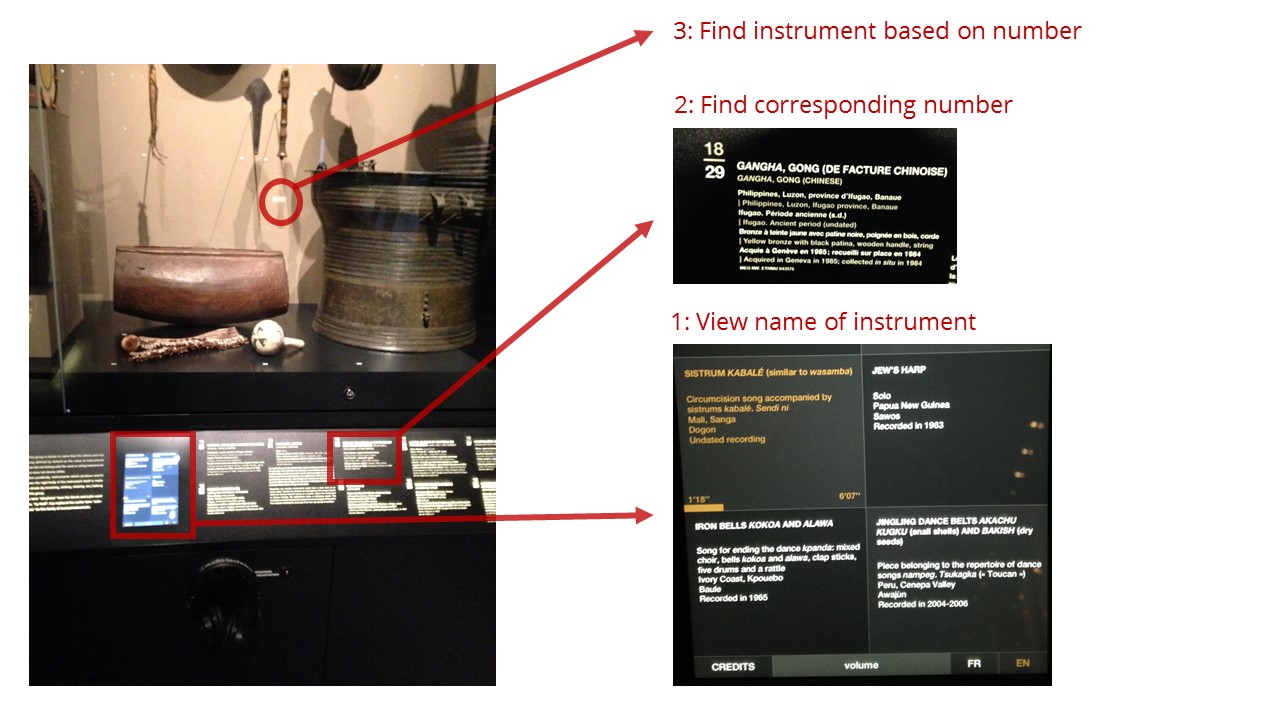
On one wall, they had ethnic musical instruments displayed on the wall with headphones below. This was to be the main “interactive” part of the museum, and I couldn’t believe how hard they made it for their users. You see, being a user experience consultant means that wherever you go, you notice these idiosyncrasies, can’t resist analysing the situation and then thinking about ways to improving it. (The parking garage ticket machines in Geneva are another pet peeve of mine ... maybe I'll write about them next.)
So here is the set-up:

Step 1: Put on the headphones and click on an instrument in the digital display panel. Unfortunately, this panel only shows 6 instruments and contains the instrument's name, but not its number. In order to locate the real instrument on the wall, you have to move to
Step 2: Try to find the instrument name in the analog panel next to the screen and remember its number – all of them starting with the same number followed by a slash and the "real" number – which then allows you to proceed to
Step 3: Locate the instrument on the wall, which have small numbers, too small for me (having forgotten my glasses).
Next to me stood a little girl clicking randomly on the different options. I didn’t blame her, since there was absolutely no connection between what was shown and what could be heard. You had to read the instrument name on the screen, then try to find it on the panel and finally search for it amongst the instruments displayed.
If this were a website, it would be like having a page with images and names, another page with names and descriptions, and a third one with only six items and their soundtracks. How would you like that? Quite unacceptable, in my opinion. However, in the real world, we still put up with so many hurdles that we simply would not tolerate online.
Now, what improvements could be made?
At the lowest level, they could add numbers to the audio display, so that you don’t have to deal with the cognitive overload of searching for the name, then memorize the number and find it again on the display. It’s not much but would help a lot. Of course, this would only be a band-aid. To go back to the website example, it would be like linking an item on one page to its counterpart on another page with an anchor link …yikes.
A next step up would be to use the description panel to directly be able to listen to the sounds – proximity of action, anyone?
Finally, a useful and nice touch would be to light up the different instruments when you click on the panel, listen to them, even hear a brief explanation – providing both visual and auditory feedback. And in the world of augmented reality, you could even imagine playing tunes yourself on the different instruments.
I bet the little girl would have learned a bit more if the museum had gone the extra mile to create something truly interactive!
*I couldn't find a direct link to the song but you can listen to his album En Solitaire here.


