Feedback and error messages
5 UX guidelines
Author: Julia Borkenhagen, CXO and Co-founder at Whitespace
Date: 23 March 2014
This is admittedly a rather dated article about feedback messages, but I believe it's still valid today. Product teams continue to repeat the same errors we saw over a decade ago.
I hope you enjoy these tips on writing feedback messages, and feel free to get in touch with me if you want to discuss the topic further. Happy reading.
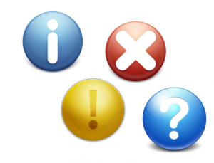
Oops! I just ruined your life.
Feedback messages have come a long way since the time of Abort – Retry – Fail. For those of you too young to remember a world without graphical interfaces, those are DOS messages.
Today’s feedback messages are rather more creative and playful, to the point where people have started making best of collections. There’s even one error message, the Fail Whale from Twitter – an illustration of a whale lifted up by birds displayed when Twitter is brought down by too many Tweets – that safely qualifies as a viral cult object. Even Microsoft’s infamous blue screen of death underwent a dramatic facelift with Windows 8.
The current trend among writers of error messages is to be cute, with expressions like “oops” and “uh oh” cropping up in some of the most frequently used applications.
Here’s Gmail:

And here's Facebook:

I tend to think it’s a good idea to become more personal when interacting with the user, but when I’ve just lost all my work, a “cute” message feels glib and patronizing, not funny. In those circumstances, what I really want to know is why it happened and what I can do about it.
5 guidelines for feedback and error messages
 Feedback messages and effects should not get overlooked in the application development process or be added as an afterthought, since they are at the core of the user / application interaction. While finding the right tone of voice is one important aspect of crafting meaningful messages, there are actually a number of additional elements to consider. Based on my experience, I have come up with 5 guidelines to follow when defining the interaction between the application and its users (let me know if you feel there’s something missing!):
- Give feedback on user action and updates on system status
- Prevent errors from happening
- Allow for easy error recovery
- Communicate clearly and consistenty
- Provide access to more information / help when needed
Let's take each of these in turn.
1. Give feedback
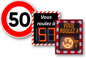 We all thrive on receiving feedback. Take the example of radar speed signs: they not only show you whether you are under or above the speed limit, but also give you a smiley or a frown. We have one close to home and my kids always urge me to make the sign smile – so of course, I slow down to a snail’s pace! This is a lot more enjoyable than “real” radars, which are punitive and not at all playful.
When it comes to applications, these personal speed signs are a good example to follow, and the more immediate the feedback, the better. This includes simple things like :
- Roll-over effects on clickable items such as icons, images, buttons, links, rows (I know, basic stuff!)
- Visually showing focus on form fields
- Validating errors line by line and
- Providing additional progress indicators, such as checks for accomplished task or indicators for password strength.
Once the user has finished a task, it is important to show system progress (if needed) and success confirmation. For example, when clicking the save button, a little animation can show that the information is actually saved (when staying on the same page). If the action is tied to a workflow, it makes sense to display a clear success message that will also communicate what will happen next.
2. Prevent errors from happening
As with drugs – prevention is better than recovery. Different techniques help to prevent errors from occurring in the first place:
- Required fields: Indicate them clearly (I know this is basic again, but still worth mentioning)
- Progressive disclosure: Only show what the user needs to see at any given time, so that they can focus on the task at hand and not skip important steps.
- Responsive enabling: Do not allow buttons to be clickable when they are not (yet).
- Forgiving formats: Allow different formats for entering data – especially for dates and numbers (e.g. I can enter 11-01-2011 or 11.1.11)
- Default values: Whenever possible, provide smart default values.
3. Allow for easy error recovery
Let’s face it: as long as there are humans and machines, we will have errors. The key is to allow the humans to recover easily from their mistakes and for the machines to not get in their way.
Go back: You should always allow the user to go back when they get stuck somewhere. This should be obvious, but is not always so. Especially with rich Internet applications, the back functionality does not always work the way the user would expect it; this is because the notion of “multiple pages” often does not exist anymore. So if the user is in a wizard and needs to go back to correct some information, he should be able to do so and not lose any information before or after.
Provide an Undo command: Most computer users are familiar with the “undo” concept, and many have a natural reflex to hit Ctr X / Cmd X whenever they want to go back a step or two. But when it comes to web applications, this functionality is often overlooked by developers, which becomes a real issue when these applications are supposed to replace desktop ones. It is nevertheless possible to implement this functionality with help of Javascript – even at multiple levels, as Google Docs has demonstrated (also featuring my other favorite – copy & paste). While difficult to implement this functionality from scratch, there are frameworks such as Cappuccino which have it built in.
You should enable users to edit or delete items whenever business processes allow them to. When workflows are involved – e.g. a document approval process – there comes a point where editing is no longer an option. However, to simply enforce that you cannot modify your review once you have submitted it is an easy way out. A more “user-friendly” system would allow you to modify until the next person in the review process has opened the file.
If an action is critical and irreversible, always ask for confirmation, usually in the case of deleting or closing unsaved items. However, for less critical events it becomes annoying to the user to always be asked whether they are “really sure” they want to delete – so it’s a fine line to walk. Consider using a “don’t ask me again” option.
4. Communicate clearly and consistently
Here is an example of what NOT to do! It is rather sad, since the one who created the message had the best intentions in the world, allowing the user to do just about anything. However, the most likely scenario in this case would be for the user to check “Never ask me again”.

So how can you avoid this kind of message? It helps to create general UI standards on when and how to display alerts, errors, confirmation messages and help text, to define the tone of voice and syntax to be used, as well as to identify common messages used throughout the application. It also helps to have some common sense. 😉
Communicating clearly means:
- Be specific
- Use common, non-technical language
- Display errors in a visible way and in proximity to their source
- Give constructive advice when possible
- Offer a clear path of what to do next
5. Provide access to more information
Opinions are divided when it comes to help and additional information. Apple for example has opted not to display any help information on their devices. (They do provide support on their website though). It is common knowledge that very few people actually consult the global help or user guide section, however, contextual help can be very useful, especially if the users are new to the system or use it infrequently.
However, it is usually a better idea to make these messages visible only upon request, since too much information tends to clutter up the screen, as you can see on this screen capture from ebay.

Field level help is probably the most effective, because it is directly in the context of the user’s action. Input prompts and hints are very useful – prompts are displayed in the input field and hints appear upon focusing on the field. If well executed, they provide the users with the comfort of knowing that they are not alone!
Here is a good example of displaying information when you need it without cluttering the screen. On top, the active text field is highlighted.

To sum it up, I believe messages should be contextual, useful, and consistent. They may even be entertaining! But remember, depending on the application you could be speaking to your grandmother, a teenager, or the CEO. So if there is any doubt, be sure to err on the side of meaningful rather than cute.