Use and misuse of the overflow icon
Observations and best practices
Author: Julia Borkenhagen, CXO and Co-founder at Whitespace
Date: 07 June 2016
The overflow menu is a user interface element that provides access to additional actions or options that are not directly visible on the screen. It is typically represented by a three-dot icon.
To avoid usability issues with this design pattern, it is important to carefully consider the placement and labeling of items in the overflow menu, and to use it only for actions that are not essential to the core functionality of the app.
Dot Dot Dot
Whenever I see 3 little dots on user interfaces – known as an overflow menu icon – I have to think of Mamma Mia, the movie.
Remember when the girl (Amanda Seyfried) reads her mother’s (Meryl Streep) diary about her wild years?
“…and then… DOT DOT DOT!”
For a refresher, watch: Honey Honey.
Unfortunately, the 3 dots on your computer screen are not half as suggestive, though they generally hide a lot of very useful actions.
Used initially on mobile screens, the overflow menu icon has also become quite the standard on desktop interfaces. And while the dots work just fine when presented in the context of other action icons, such as shown in this Twitter capture below, they tend to be overlooked in other circumstances.
One reason that the overflow menu icon may be misused is that it is often used as a catch-all for actions that do not fit conveniently elsewhere in the user interface. This can result in a cluttered menu with a large number of options, making it difficult for users to find the action they are looking for.
Another reason is that the overflow menu icon is not always clearly labeled, which can make it confusing for users to understand what actions are available through the menu. This can lead to frustration and a poor user experience.

Icon abuse
One of these cases is SharePoint 2013, which introduced the 3 dots for their action menu in document libraries. Having used SharePoint quite extensively and trained many users, I do wonder whether this design was ever seriously tested with average end users.
Whereas SharePoint 2010 featured a drop down menu that allowed you to access all the actions for a document in a single click, the 2013 version forces you to find and click on the “overflow menu” – not once, but twice!
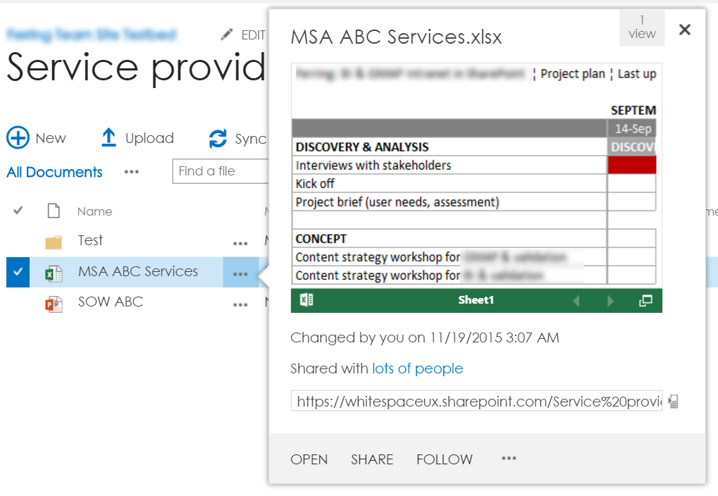
As you can see on the screen capture, the overflow icon is combined with actions displayed in regular text. This combination makes the icon much less visible than in the Twitter example above. Even worse, the actions exposed are not necessarily the most used ones.
Another problematic example can be found in the Google Apps for Work interface. To modify your payment information, you need to click on the overflow menu icon.
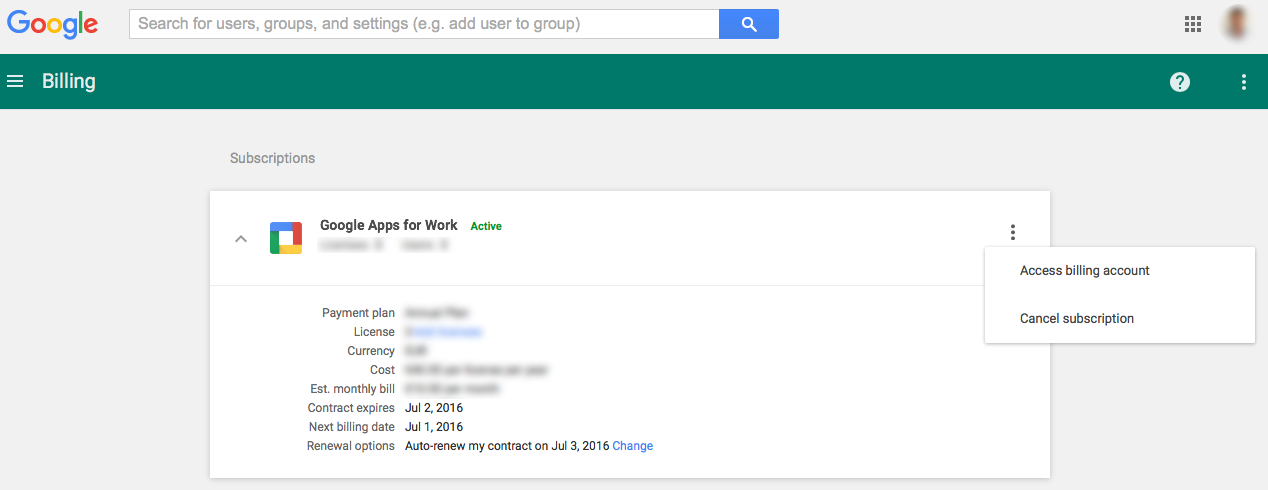
Not only are the 3 dots displayed vertically (according to Luke Wroblewski, that’s called a Kebab menu – as opposed to Meatball menu), but they are also used in complete isolation on the screen, twice! The top one hides “Preferences”, and nothing else, while the other one allows you to modify your invoice information or to cancel your subscription.
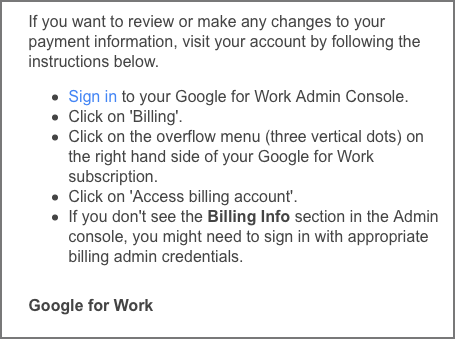
I am all for uncluttered interfaces, but this one just feels empty. Clearly, people must have run into issues, because the monthly invoice email contains detailed steps on how to “update your payment information.”
Overflow vs. Ellipsis
Looking back historically, the 3 dots were and are still used in desktop applications for command menus that required further information, such as Save as… or Print… The technical term is “ellipsis” and it was never meant to be used on its own. (For more info on how to use the ellipsis, see this discussion on Stackoverflow.)
That’s the reason why the overflow icon works when used in combination with other icons, but much less in combination with text actions.
It really falls flat when displayed as a stand-alone icon, since the original meaning of “more” is then completely lost. More of what? Nothing?

