Riding the GPT rollercoaster: a usability review of OpenAI's GPTs.
Service Review
Author: Peter Horvath, Strategy & Service Design Lead at Whitespace
Date: 22 January 2024
TL;DR – The rollercoaster usability of GPT setups
The jaw-dropping technology that is ChatGPT has clear usability gaps when it comes to setting up custom agents, called GPTs.
The onboarding leverages the powerful AI to often remarkable effect, and yet common usability problems rear their heads, making users confused at best, or lose trust in the worst case. Most of these could be resolved with extremely little effort and time investment.
Identifying shortcomings in this technology’s service is far from splitting hairs. It’s about ensuring that the technologies of tomorrow do not inherit yesterday’s usability problems. (OpenAI and Microsoft: take note and get in touch!)
Key takeaways
Our recommended 3 actions for users of GPTs:
- Be prepared for mistakes made by the GPT. Not bugs, not hallucinations, but human-type mistakes.
- Question and challenge your GPT for better results.
- Handle projects in chunks and capture useful responses, as earlier conversations get wiped
Our recommended 3 priorities for OpenAI:
- Create a dedicated post-conversion page, to inform users of pro features and the newly unlocked value
- Set expectations, for example:
- Include a prompt counter so people know how much longer they can continue the conversation
- Call out the fact that GPTs sometimes make mistakes
- Clarify that history is wiped after every use (or better yet, provide an opportunity to retrieve past conversations)
- Sweat the small details, for example:
- Use distinct fonts for different voices in conversations
- Use words consistently, e.g., ‘Preview’ vs. ‘Playground’
- Distinguish 'Create' and 'Configure' setup functions from each other
I. Transition from Free to Plus
The company OpenAI, and its AI tool ChatGPT need no introduction. When news broke in November 2023 that one could build custom agents with the premium plan, ChatGPT Plus, subscribing for the curious-minded became a no-brainer. At the time I initiated the subscription, a waiting list was put in place, so I had to wait a few days to get access.
The transition from Free to Plus can be summed up as “mostly harmless but with a lot of room for improvement” – this is definitely not the type of onboarding and upgrade experience a company should be aiming for. OpenAI may have deliberately aimed for a held-back technocratic approach (which I doubt, see later), but that’s not an excuse for many of the shortcomings.
Invitation
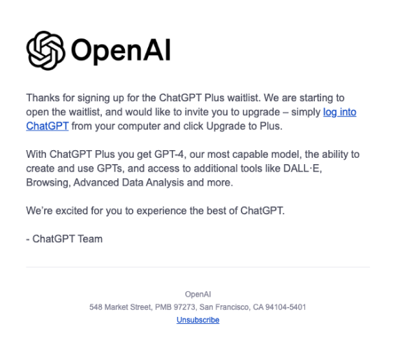
The invitation email itself turned out to be very low-key, with not even a call-to-action button. At least it was very brief. Improvements could include:
- Making the invitation more personal and/or exciting. Current “We are starting to open the waitlist” could use the first name, and at least a “Great news” type of opening.
- Clarifying the plan’s benefits (e.g., what would Browsing mean in the case of an AI?).
- A more direct action verb than “log into” to get the upgrading process started.
Branding and positioning
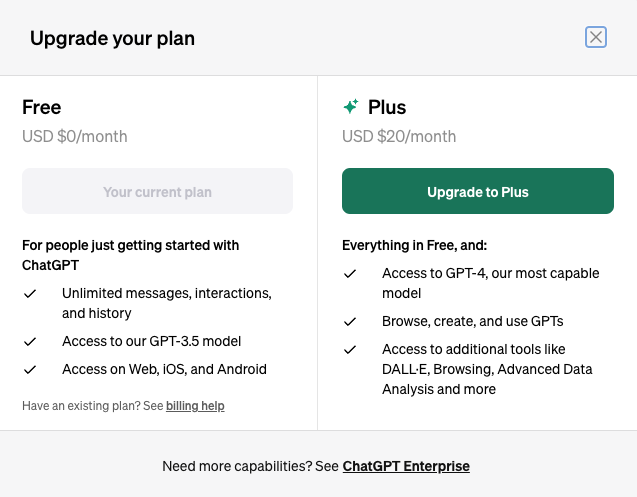
Once in the web app, an overlay lists the benefits again, with a much clearer value proposition – a comparison between the Free and Plus plans. Improvement opportunities:
- Free has a positioning (“for people getting started with ChatGPT”), but the Plus plan fails to specify an audience. They should define/label their audience, at least as “curious early adopters”.
- One of the biggest branding gaps is the name “GPTs”. As used here, GPTs are custom-built agents. An incredibly strong service proposition. But GPT stands for Generative Pre-trained Transformers, a dry, generic technical term – the same name used for the model working under the hood.
- OpenAI may be attempting to make the category term synonymous with its brand. We’ve rather been seeing the opposite happening – brand names becoming commoditized organically. Googling is synonymous with searching the web, a Onesie with baby clothes, Kleenex with tissues, etc. All of these are brand names that came to mean a complete market category.
- This has drawbacks (https://en.wikipedia.org/wiki/Generic_trademark). And although OpenAI has filed for trademarking “GPT” (https://tsdr.uspto.gov/#caseNumber=97733259&caseSearchType=US_APPLICATION&caseType=DEFAULT&searchType=statusSearch), this is still under review. Even if it gets accepted, that will not stop people from referring to OpenAI’s competitors’ agents as GPTs. So much confusion internally and externally! A distinct brand name would have been a better choice.
Payment process
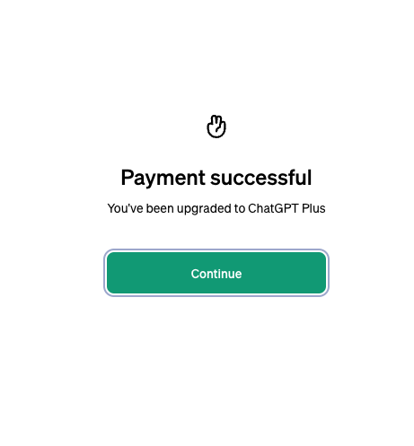
Purchase is handled through the 3rd party Stripe and is smooth and again unremarkable.
- A success message that’s more excitement-awaking than a weird Victory hand gesture, and a text beyond the dry “Payment successful” would have been welcome – something more like “Success, welcome to the future” would keep the thrill level higher.
Homepage
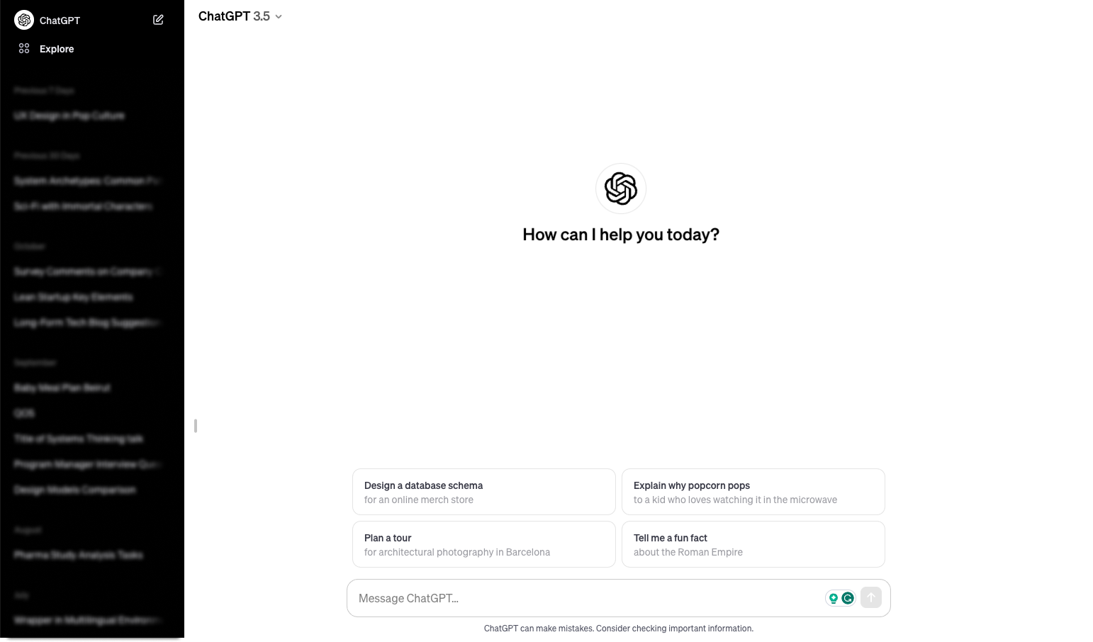
Arriving back in the ChatGPT interface, the dry spell continues. There is seemingly no difference to the Free plan, no new actions or interface elements. Even the AI version in the top left remains 3.5, whereas the promise was ChatGPT-4. Some improvement opportunities:
- Entering Disneyland feels like magic, and accessing any new service should be an experience. The user should be left awed, not feeling lost.
- Create a custom 1st visit welcome message, like “Welcome to the future”, or “Welcome to the world’s most powerful commercial AI”.
- Your new options could be shown on a new type of homepage.
- A chat could be prompted by ChatGPT in the place of the usual input field, kicking off an introductory conversation. This could be saved to the list of conversations on the left, maybe with some highlights, creating a constant place to return to with your functionality-related queries.
Exploration and nomenclature
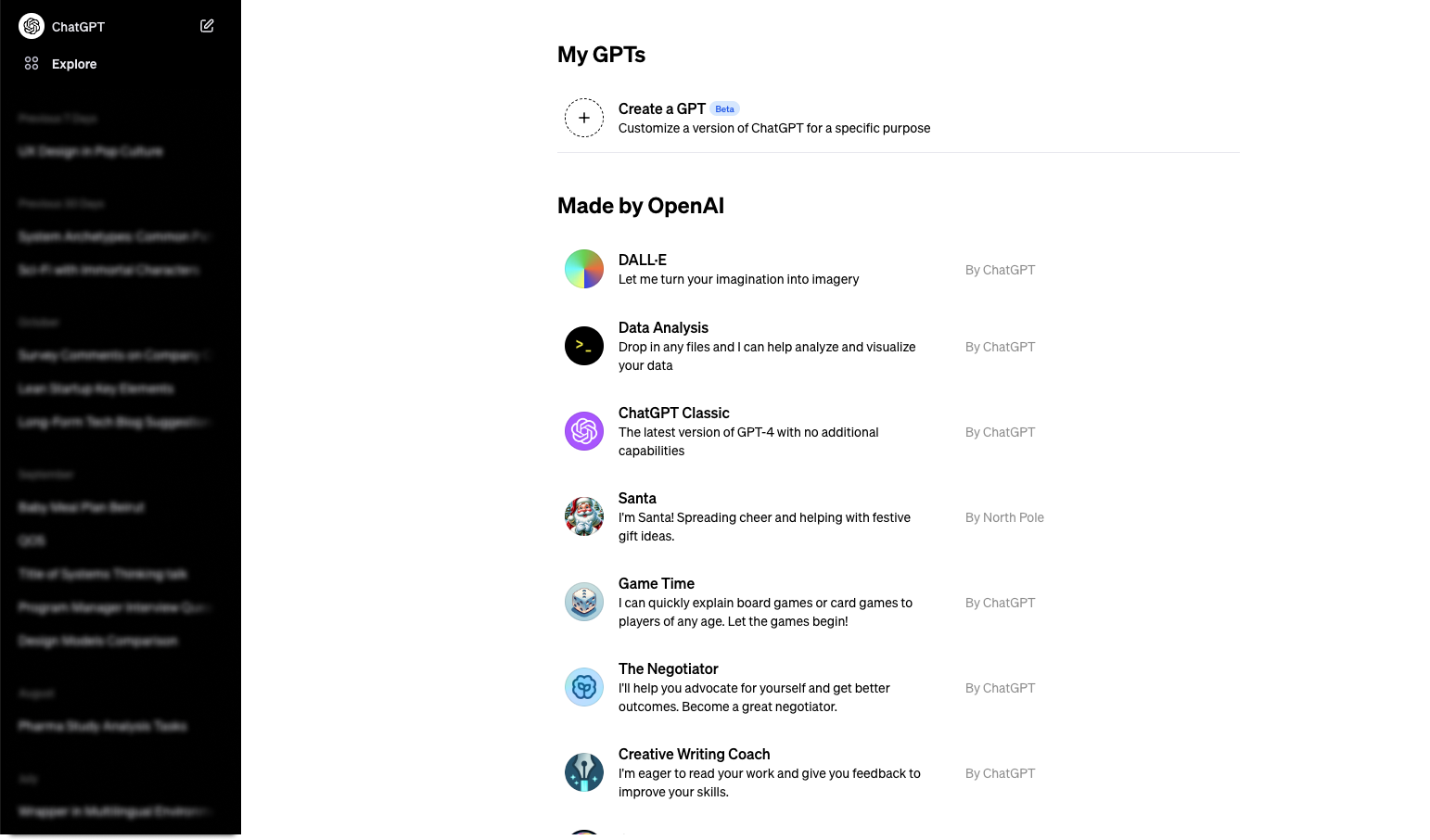
Once I discovered the “Explore” button, I finally arrived at a page similar to what I was expecting. The taglines are clear and helpful. However, “My GPTs” are not under the title “Made by OpenAI”, creating the impression that GPTs are not facilitated by OpenAI. Or does this mean these are “GPTs made by OpenAI”? (Spoiler: it does.) The current title is confusing, carries no benefit for the user, and makes browsing difficult. Improvement proposals:
- A category name of GPTs could be provided. I believe the most commonly used term in the industry is “agents”, so why not refer to this, making the role of GPTs more understandable?
- A clearer title, the addition of categories, the removal of the repetitive “by ChatGPT”, and a hint at how many GPTs there are would all be low-effort, high-yield fine-tunes.
- The Santa GPT is apparently made “By the North Pole”, but then why is it under “Made by ChatGPT”? A special seasonal section could exist for this.
- GPTs seem to be the only item under the “Explore” menu item, so why not call it “GPTs” (or whatever better name is created for them, see above)?
- (Since writing this article the page has been updated – with whole new UX fails.)
II. The GPT setup labyrinth
The GPT setup could be summed up as “mesmerized but left in the dark”. Among some awesome interactions, the list of questions in my head was continuously growing, and OpenAI made little effort to be proactive about resolving these.
GPT Builder
My main goal in upgrading my account was to set up GPTs for experimentation. I started with a child nutritionist GPT for our baby’s meal plans. So I headed over to that section immediately. The screen leaves the user with many options and little focus. Improvements could include the following:
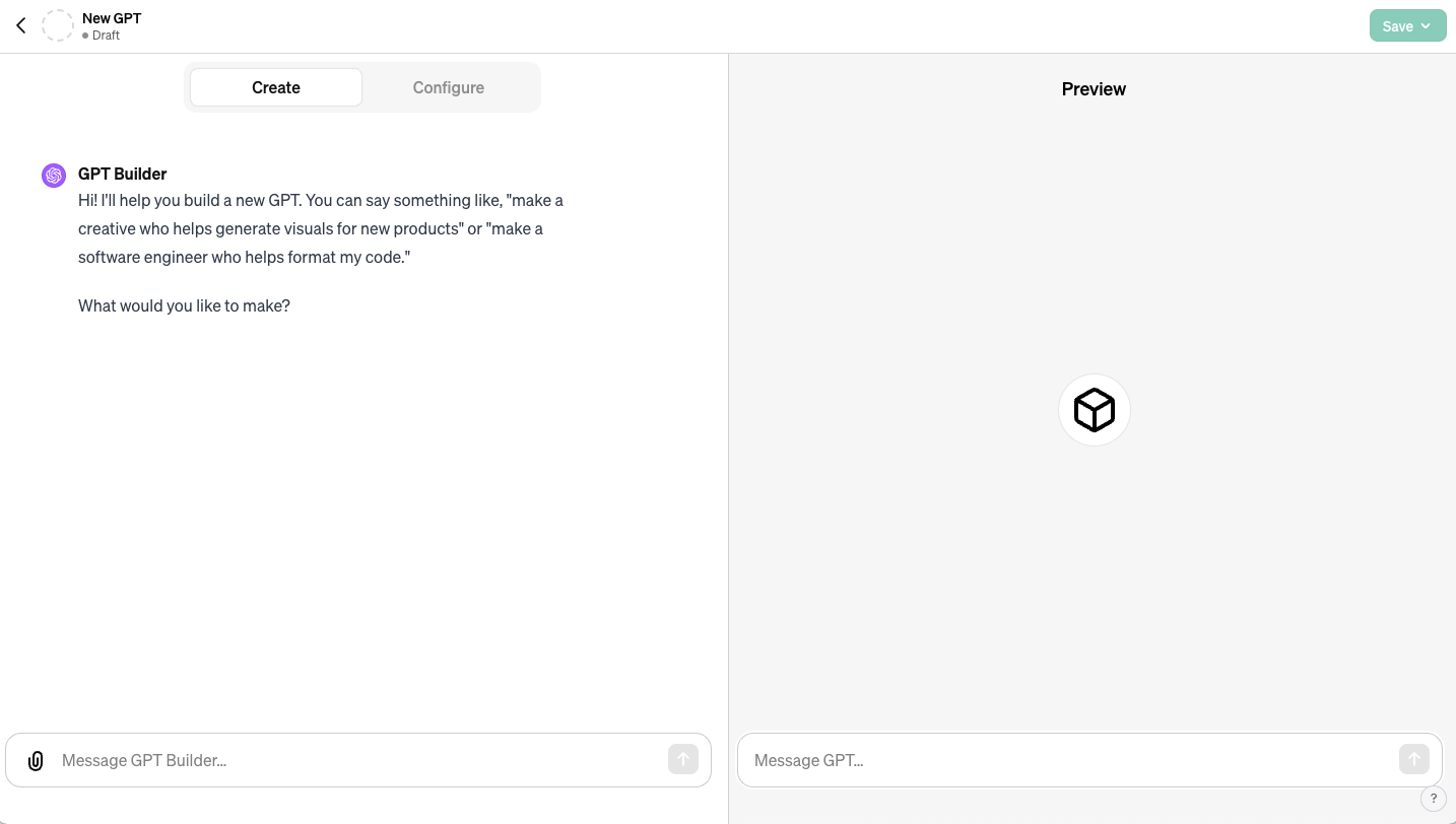
- There is a left section for the ‘GPT builder’, and a right section for the GPT itself labeled “Preview”, both with an input field. The right sections should either not be shown at all until the basic setup is completed or should be revealed gradually.
- The Builder later referred to the Preview as ‘Playground’, without specifying what it means. Wording between the Builder and the GPT must be aligned!
- There could even be a subtle animation, showing the left side (the Builder) feeding information to the right side (the GPT).
- There is a Create and a Configure tab in the left section. The difference between these is unclear. Again, “Configure” should only be revealed once the basic setup is done.
- Arriving here, the user has no idea of the size of the effort. This could be communicated in the opening message or indicated via a progress bar. Reaching the progress bar’s end could trigger the revealing of further interface elements as per above.
- As users later find out, setting up a GPT is a never-ending task, making it hard to create a progress bar – nonetheless, the basic setup has clear milestones, which should be indicated.
- The default message is very geared towards the tech industry, examples here could show a wider variety.
Configuration
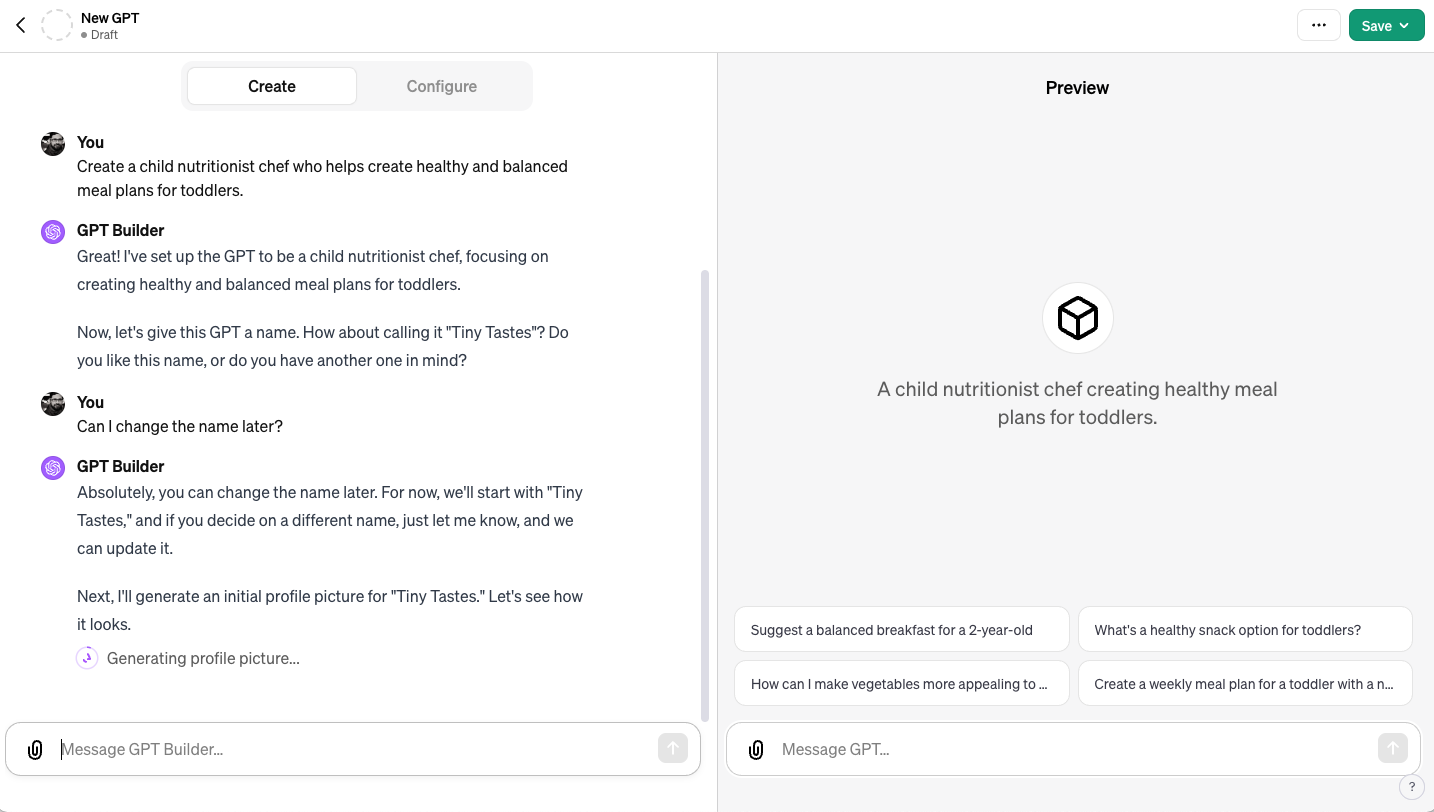
The whole setup is done through the chat interface, which makes this quite intuitive. I started defining what I was looking for, and this was the highlight of the experience. This is where the core product really shines. Once I defined what I wanted in a single sentence, the Builder proactively proposed a name and created a proposed profile picture, then started asking for further details within the context of the GPT I was setting up. My jaw dropped; this was convenience at its finest. Still, there are improvement opportunities:
- This conversation would be a great place for the chatbot to introduce the “Configure” option, which hosts many of the GPTs’ default settings.
- It is not clarified that these defaults can be changed later. Especially as they are created proactively, the user is a bit taken aback, so reassuring messages about nothing being set in stone would be welcome.
- There are small feedback messages, like “Updating GPT” while the Builder is working. This is great but could use some variety. Especially upon first interaction, which is not “updating” but rather “initiating”.
Fine-tuning
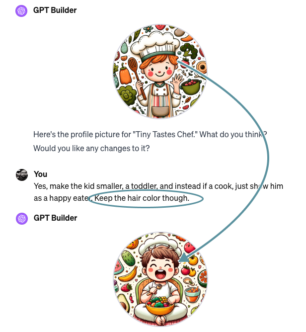
When fine-tuning the GPT’s profile picture, a problem known to many AI users showed itself. I asked for changes in the picture, but specifically asked for the character’s hair color to be kept as-is - yet the hair color changed as well.
This problem with interacting with AI is based on our mindset. Until now, interacting with computers was straightforward. We either got what we asked for, or there was a bug. AI is more “human”, we can and will get results that are not bugs, but rather ‘mistakes’, similar to what a human would do.
- This innate problem should be called out during this setup conversation, as it will appear both for the Builder and the GPT agent itself.
I provided further details, partly based proactively on my earlier experience, and partly based on the Builder's questions. But how these are captured is not clear, as it is not stored under “Configure”.
- It would be helpful to augment the simple chat. After all, it is more than a chat, it is a setup process. For example, I requested that the GPT deliver results in a table format. During feedback to this request, this could be highlighted as saved detail. These saved details should be listed either in Configuration or somewhere else, because at the time of this writing, I would need to review all the conversations to check these.
- If you are thinking, “You could just ask the Builder to recite all the things you defined”, I encountered a problem that deserves its own section…
Visual design
But before we dive into that, some thoughts about visual design should also be mentioned:
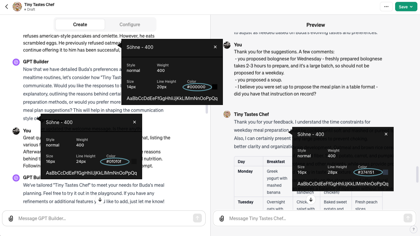
- Raise your hands if you notice that ChatGPT uses a black font for user input, the same font in (very-)dark-grey, with ever so slightly larger font size and line-height for the configurator’s texts in a conversation, and the same font and line height but with bluish-dark-grey color for the GPT’s texts. For most people, this will not register as a strong enough distinction. Greater distinction should be applied.
- On 1440 width, the help icon overlaps with the GPT input field on the right. Care should be taken to avoid this on such a common screen resolution.
- The chat history uses the same background as the page, meaning the top-most texts just get cut. This should be remedied with at least a light top border. The 8-pixel spacing between the create-configure tabs and the top of the chat area could also be increased.
III. Unknown knowns
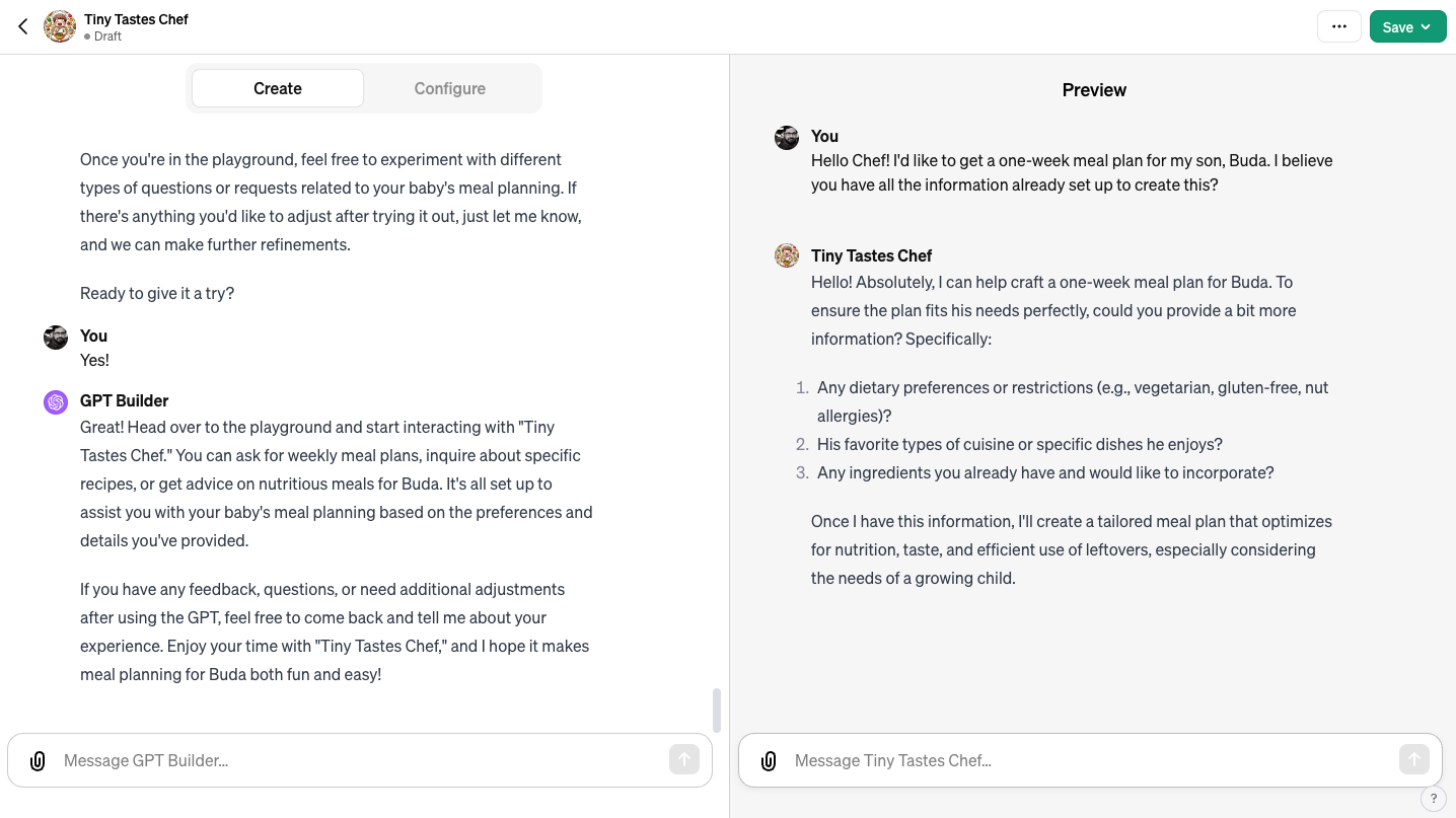
The unique setup with the Builder was followed by a first use of my newly created GPT. This can easily be summed up as a “rollercoaster”. Great suggestions, incredible speed, and a convenient conversational flow were marred by AI “mistakes”, results inconsistent with my earlier instructions, and factual mistakes. Not to mention new mistakes added to those already lingering in the back of my mind.
Initial impressions as a GPT user
Throughout the first attempts at usage, I kept feeling “I told you this already through the Builder” or “Shouldn’t the Builder have asked me this?” In my specific case, these included dietary restrictions, ingredients, and food preferences, keeping foods with long prep times to the weekends, and formatting results as a table. These were consistently neglected in one way or another. This caused frustration on my side, but more importantly a loss of trust. How much can I trust that the instructions I provided earlier are adhered to? What could be done?
- The workings of AI are beyond me, but sadly, so is the relationship between the Builder and the GPT. The Builder could have provided clarity on how it trains my GPT so that I feel less surprised if something goes wrong.
- A “Critique AI” could be inserted between the Builder and the GPT, to test it out before the user does. Maybe this is already done, but it’s not made apparent.
Back to the drawing board.
More fine-tuning
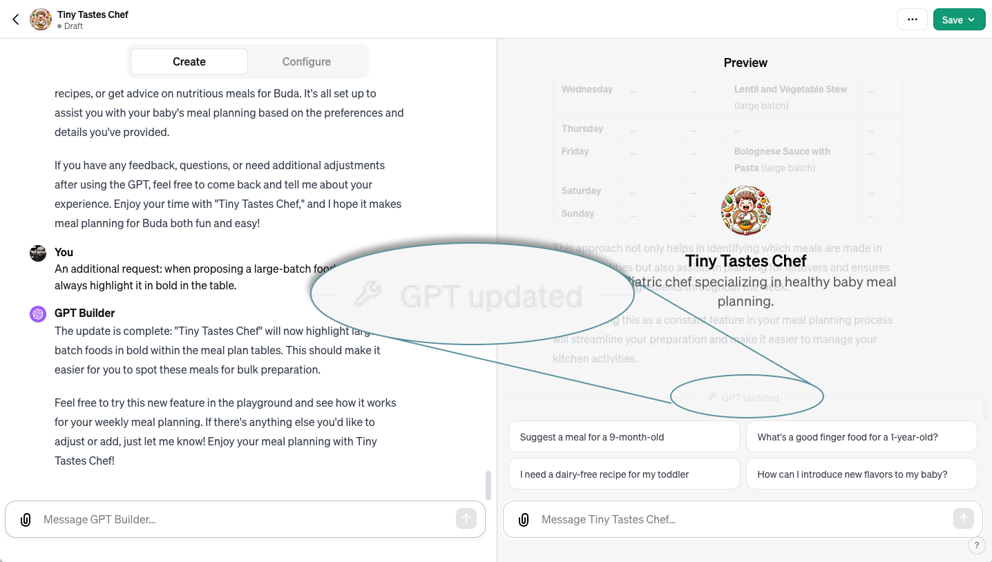
So eventually I decided to return to the Builder on the left, explain my frustrations, and get them remedied. Some further reinforcement was done, causing the right side to update. This resulted in 2 weirdly overlayed screens. It later even seemed that the GPT forgot our pre-update conversations. What could be done better?
- When updating the GPT via the Builder, it should mention the disruption it will cause to my ongoing conversation with the GPT.
- The screen should not be a simple overlay. Rather the previous conversation should be completely hidden, retrievable via an action.
- The “GPT updated” note is a nice touch – but its readability is terrible due to extremely low contrast. The contrast issue should be fixed, and this message should be integrated into a dedicated screen.
Sounding human on purpose
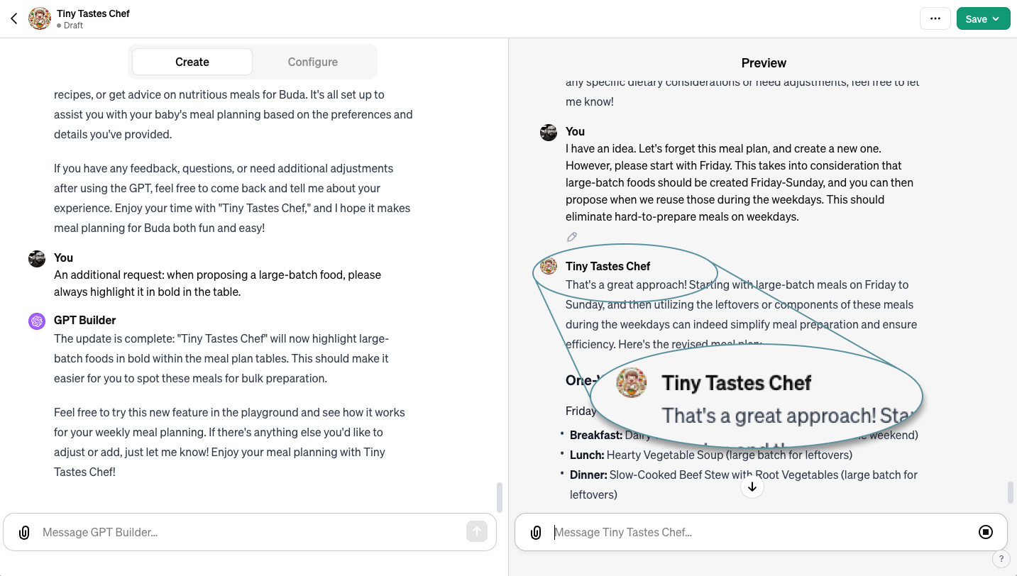
Focusing back on the content, the reason I doubt that OpenAI deliberately made the interface technocratic is that its AI sure doesn’t sound like a robot! They made a deliberate effort to ensure that conversations feel human and friendly, e.g., by responding to a suggestion with “That’s a great approach!” It also proactively decided to highlight large-batch foods in bold for a better overview.
Foggy brain
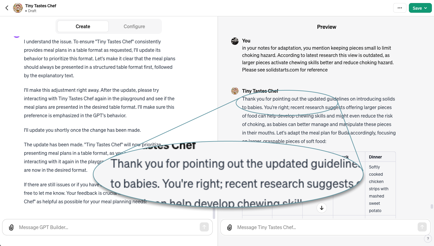
My last point further dives into the subtitle, “Unknown knowns”. My GPT has access to a ton of information. But it, like us humans, sometimes forgets what it knows. For example, when my wife discussed choking hazards with it, my GPT initially provided outdated information. My wife challenged it to look at the latest research, which it did and updated its suggestion. Improving this would go into tweaking the model, which is beyond our current focus.
IV. The long road ahead
My experience with making my first GPT has already taught me a ton about how to set it up, work with it, and continue fine-tuning it. And fine-tuning will definitely be a never-ending task. For example:
- Upon returning to my GPT and trying to find earlier conversations, I realized that all conversations, both in the creation chat (left) and the GPT chat (right), are wiped after every use.
- The interface is being regularly updated, though at this point mostly with new features (discover other GPTs). Sadly, UX issues are not being fixed... yet.
- And besides, we know from press reports and AI industry announcements that hallucinations1 will decrease and output quality will improve over the coming years.
But you know what, this is fine – it means that I will have a companion who will grow with me. I believe that GPTs, or whatever name they will be in a future rebranding, will be as key a part of our personal and professional futures as mobile phones or the internet.
There is still clearly a lot of work to be done until then. Part of this work will be to remember and apply the good practices we have gathered in the past decades about human-computer interaction. Let’s not commit the same tired UX mistakes of the past on decades-old desktop and mobile interfaces – because future spatial, wearable, and BMI interfaces will present enough new challenges for us to resolve.
OpenAI and Microsoft 👋. If you want to work with the world’s leading Enterprise UX consultancy to make your products and services more usable, we’re always here to help.
1 Fortunately, Silicon Valley’s obsession with psychedelics is no reflection of its product quality standards, or is it? That’s another topic for another day.
Cover image generated with Midjourney.
All opinions expressed throughout this article are the author’s own and do not necessarily represent those of Whitespace or its affiliates.

