Higher Ed
Enabling continuous improvement for a world-leading university
Case Study
Never stop learning
We go to school to improve ourselves. To always strive for more. This same mindset led our client, a world-leading university in its field, to take a closer look at its learning management system (LMS).
Education is close to our hearts at Whitespace, with multiple team members working or having worked as lecturers at universities or having been invited as guest speakers. Not to mention our strong belief in continuous learning, to which team members are free to allocate part of their working hours.
So it was a great pleasure to be invited to the pitch and be selected to do a heuristic evaluation for the university’s LMS. As a client-turned-teammate put it, “Heuristic reviews just tell me what I already know, just in a more sophisticated way.” The review was merely a starting point, and our continuous improvement journey has only just begun.
Client
World-leading university
Sector
Higher Education
Project
Multi-platform heuristic evaluation with actionable recommendations
Activities
Heuristic review
Workshops
Wireframes
User journey maps
Strategy
Technologies
Moodle
Miro
Can’t quite put my finger on it
The university was aware that students who grew up with digital platforms come to them with increasingly high expectations about what a digital learning experience looks like. And the team was aware that their current solution did not live up to scrutiny. However, they lacked the capacity and deep domain expertise to structure the issues and find solutions.
Many LMSs (Learning Management Systems) suffer from the same situation as internal digital tools: compared to the latest tech people use in their everyday lives, they seem outdated, carrying years or even decades of legacy with them.
If relying on their own intuition was not enough for our client to see the shortcomings of their digital experience, student complaints about specific issues reminded them. This was becoming an increasingly pressing issue, as the digital department is planning to increase the emphasis on online programs.
A perfect match
Whitespace was the perfect match for the task. Not only do we bring deep UX knowledge, and pair it with a strategic and experience-driven mindset, but we are active educators and students at the same time. As icing on the cake, we were familiar with the client’s system of choice both from a developer and user perspective.
The team at the university boasted great diversity, consisting of educational designers, led by the department head, and also including IT and staff close to the students.
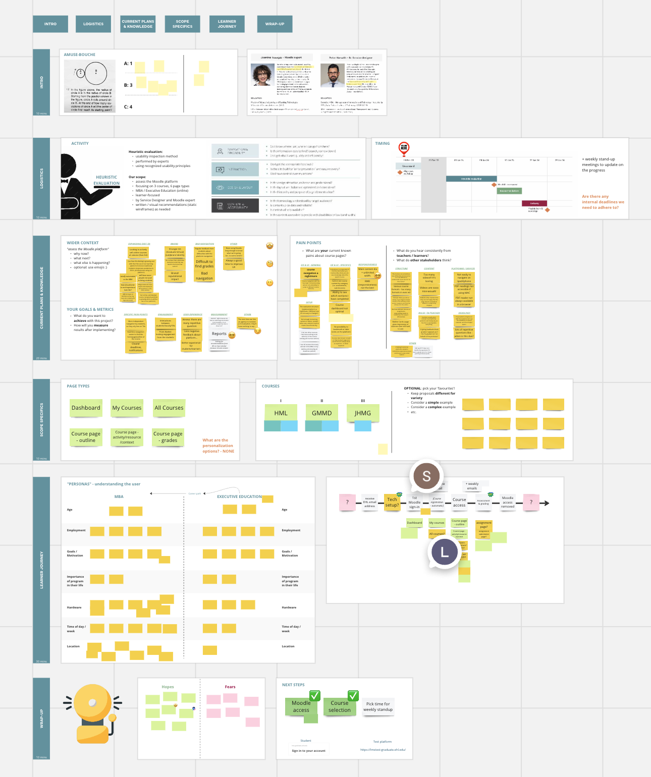
These combinations of expertise, which came together in a project-defining kickoff workshop, ensured that the challenge would be approached from multiple viewpoints, and enriched with first-hand insights.
Thank you for the exceptional quality of your work on this project. Your comprehensive reports and insightful presentation have allowed us to identify numerous areas of improvement.
Learning designer
Keeping the focus
Our assignment was specified by the number page types to review. But students do not see a learning experience as pages. They see them as tasks and journeys. So our review had to expand, to make sure we cover a full student experience.
Multiple challenges reared their heads during the project:
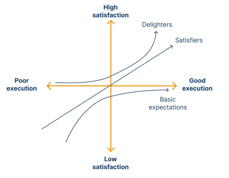
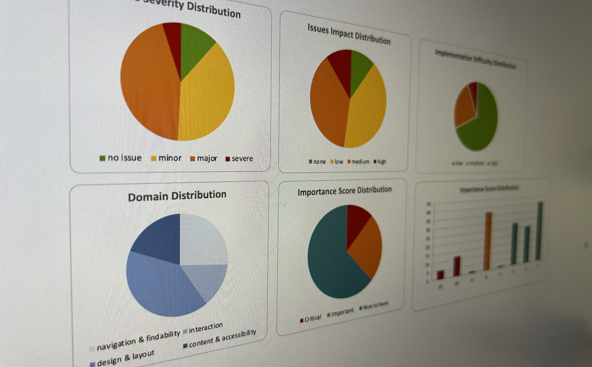
- We reached over 150 issues in no time. But how do you make such a high number of issues manageable? We tagged them along multiple dimensions, allowing the team to slice the issues in various ways, e.g., by impact score, component type, or a combination of these.
- Working in an existing 3rd party platform means you need to balance the granularity of recommendations with system capabilities. But how do we ensure we push the boundaries of what is possible? We used a push-and-pull approach, whereby we identified ideal UX solutions, and then reviewed them from a feasibility perspective. Where limitations were identified, we iterated back and forth between designer and developer, to find a solution proposal that fits the importance of issues.
- Focusing on only the big issues could hide the fact that issues with smaller impact can also cause a “death by a thousand cuts”. So how do you ensure you identify issues both big and small? We combined the strengths of industry best practices such as NNG’s 10 Usability Heuristics, the VIMM model, Mayer’s 12 Principles of Multimedia Learning, etc., to create our own review criteria.

The forest from the trees
Even with a spreadsheet that you can slice and dice in multiple ways to create a development backlog, you are still facing hundreds of issues to fix. This would be overwhelming to anyone, and being strategic-minded, we were aware of this.
So instead of touting the large number of issues and recommendations we had identified, we took a step back. We defined a student journey through the most important touchpoints, or Moments of Truth (MoT), and linked the issues to these.
As a result, we could present issues in a larger context, and a new, actionable dimension of prioritization.
- Even though emojis appearing as a broken image in a chat preview is of low impact, this weighs on the MoT journey due to the collaborative nature of studying, and to the habit of scanning messages.
- On the other hand, one page used impractical controls, making it a high-severity issue – but as the page lies outside of the MoT journey, fixing this could be temporarily de-prioritized.

Key stats
150+
Issues identified, tagged, & prioritized
20+
Templates evaluated heuristically
100%
Solutions found to issues
3+
Courses compared for content
Peter Horvath
Strategy & Service Design Lead
The greatest compliment that our multi-functional team could get was that the more technical stakeholders saw the outputs as very practical and actionable, while the more design-minded stakeholders noticed the nuances of our experience design approach.
More from our portfolio
Like what you see?
